Zero Errors, 100% Speed: The Science of Smart Picking
Pick Mate is a warehouse picking assistant designed to streamline the order picking process across METRO’s logistics operations. The previous Odoo-based interface was difficult to navigate on Zebra handheld devices, leading to user errors, inefficiencies, and delays. Our goal was to redesign the experience to support faster picking, reduce mistakes, and give pickers more clarity and control even in constrained, real-world conditions.
METRO Markets
UX Designer
E-commerce
Product Handlers,
Warehouse Country
Managers
3 Months
Challenge
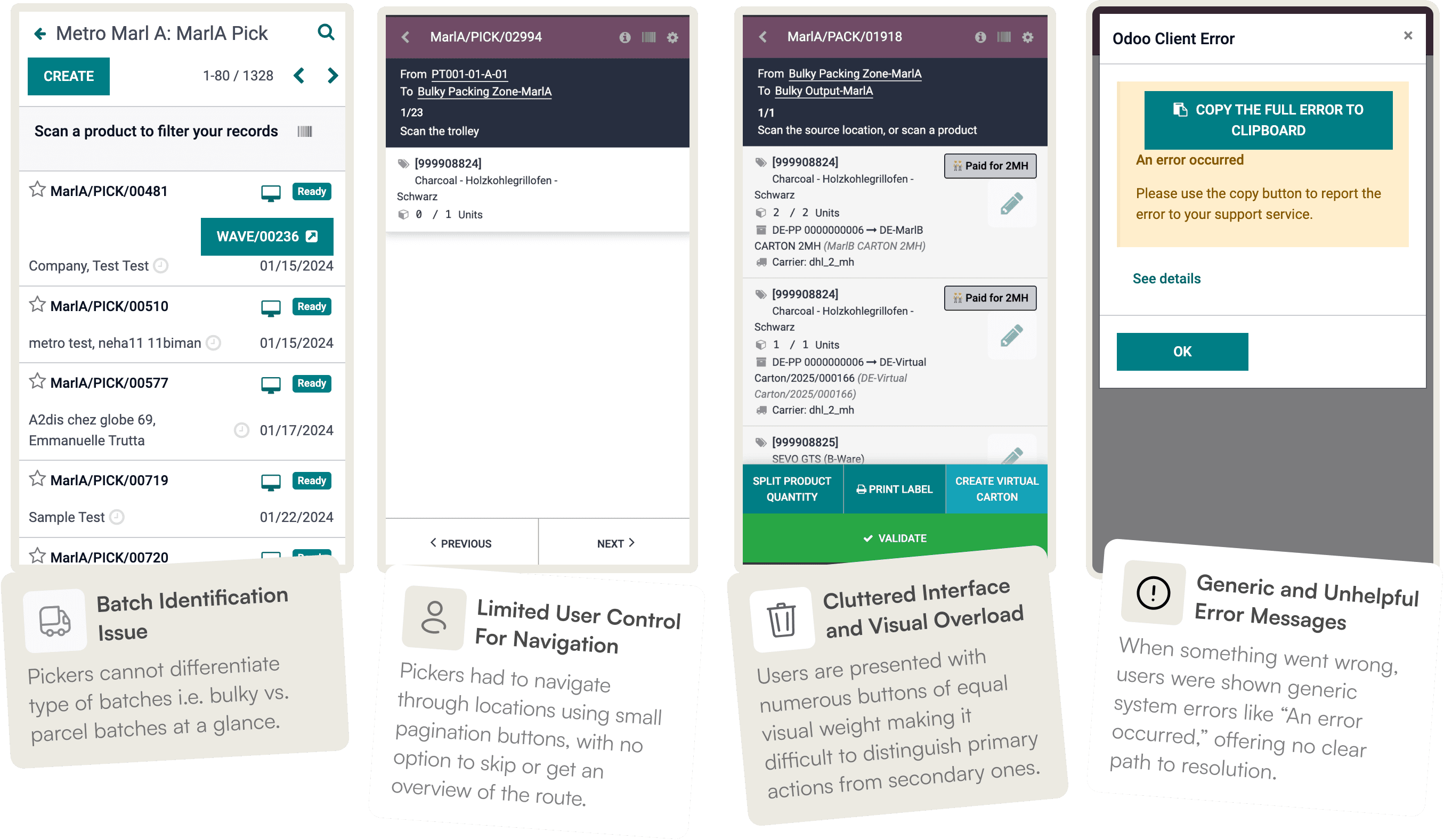
Pickers had to work around an interface that didn’t align with the actual warehouse flow. Actions were scattered across multiple screens with minimal feedback or instruction. This made it hard to follow the correct picking sequence, especially under time pressure or when handling complex container scenarios.
Results
The redesigned app improved clarity and feedback, guiding users with just-in-time instructions.
By simplifying the flows and tailoring the UI to the device constraints, we saw a perfect 100% accuracy and 22% reduction in order pick cycle time.
100%
Accuracy of orders picked
successfully
22%
Improved average order pick
cycle time
88%
Improved first-time-pick-rate (FTPR)
Understanding the Picking Firsthand

Shadowing Pickers in the Warehouse
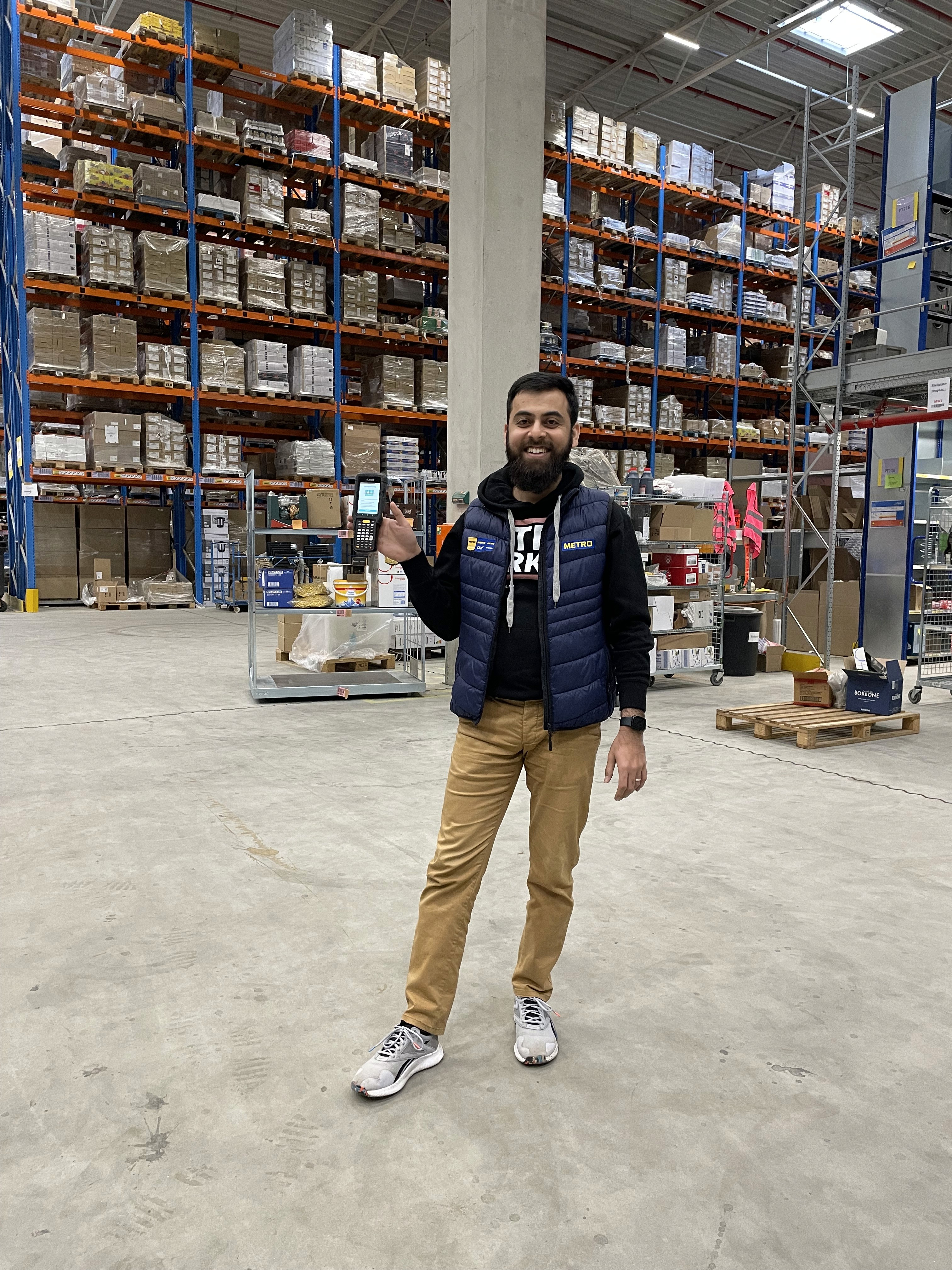
To design an experience that truly supports our warehouse teams, I began by immersing myself in their daily environment. I visited two of METRO’s warehouses and shadowed users aka Pickers during their shifts to understand the realities of their workflow.
Using a Zebra handheld device, the same one used by pickers, I followed both Parcel and Bulky order flows, observing how they scanned locations, handled products, and interacted with the interface on the go.
These visits were essential to gain empathy for the users and spot friction points that might not be visible from the UI alone.
Mapping the Picking Flows: Parcel vs. Bulky
After the warehouse visit, I mapped out the end-to-end picking flows for both Parcel and Bulky orders. While both flows start similarly i.e. locating and scanning products, they diverge significantly in how cartons are handled and how products are grouped.

The on-site visit and flow mapping surfaced several insights that shaped the direction of the redesign:
Speed and muscle memory are critical: Pickers aim to complete tasks quickly, and even small UI delays or extra taps can disrupt their flow.
Error messages are often ignored: System messages were too technical or vague, leading users to bypass them or rely on team leads for help.
Parcel vs. Bulky tasks require different tools: Bulky pickers often need extra actions (e.g., container edits, carrier changes) that were cluttering the interface for Parcel users.
Heuristic Evaluation
UX Goals and Success Criteria
Based on the field observations and heuristic evaluation, I defined the following UX goals to guide the redesign:
UX Goals
Simplify core picking actions to reduce effort and time.
Improve touch target usability on Zebra devices.
Create a cleaner UI with clear visual hierarchy.
Adapt flows to match Parcel and Bulky picking needs.
Provide clear, actionable error messages.
Success Criteria
Fewer taps per pick step.
Faster task completion in usability tests.
Higher confidence and fewer help requests from users.
Early Ideation
With a clear understanding of the pick workflow, I began by mapping out the new user flow tailored to both Parcel and Bulky orders. The focus was on creating a simple, transparent interface that supports fast, error-free picking.

New pick user flow
I explored multiple layout variations and interaction patterns, iterating on how to streamline key actions while keeping the interface intuitive on a small Zebra device screen.

Early wireframe exploration
Designing the New Experience
The redesign focused on creating a clean, minimal interface that supports fast, accurate picking while reducing cognitive load. I prioritized clarity, removed unnecessary features, and introduced better instructions and feedback throughout the flow.
Designing for Constraints
One of the biggest challenges was the screen size. The Zebra device used in the warehouse has a very limited working area (320×534px), further reduced by a persistent status and navigation bar. This made every pixel count. I had to be intentional with spacing, hierarchy, and interaction design to ensure usability under tight conditions.


Flows Definition
To simplify the experience and reduce user confusion, I divided the picking process into three distinct flows:
Happy Path
The ideal scenario where the picker successfully scans and collects all items, and completes the drop-off.Split & Reassign Path
A flexible flow allowing the user to split cartons and reassign containers when items don’t fit or need re-routing.Sad Path
A fallback path where issues like missing products or blocked locations prevent the picker from continuing. In such cases, the UI directs the user to notify the team lead.

Happy path

Split products and reassign containers
Conclusion
The Pick Mate redesign transformed a cluttered, error-prone process into a streamlined and reliable experience. By focusing on real warehouse challenges, we created a minimal, guided interface that supports pickers through every scenario, from routine picks to exceptions. The result: higher accuracy, faster cycle times, and a smoother day-to-day workflow for the teams on the ground.